Graphic designers make a big difference to readers and the success of authors. A snarky writer once told me I was a hack, too concerned about the look of my book covers. Once.
Everyone else knows, yes, of course we do indeed judge books by their covers.
You can say it shouldn’t matter all you want, but beautiful people and beautiful things get more attention. I won’t find out if you have a great personality and keen intelligence if, when I spot you from across the room, you appear to be surrounded by flies because you’ve rubbed dog feces in your hair. That’s life. That’s science.
Kit is my friend and ally. He helps to make my existence matter. He’s helping me get my message out, subliminal and subtextual. It’s that important. All my books are about escaping who I was. They’re about all of us rising to the higher potential of what we could be. Everything I write is about making our existence — yours and mine — matter. Book covers are the come hither stare that lets me into your brain, to play in the Mindfield, to turn the words, to entertain, laugh and think. That’s what it means and why Art matters.
That’s the why. A book cover with solid art is part of the how.
This is probably the sort of topic where, if you get it, you don’t need it. If you don’t see it, you probably never will. (Then why blog about it? Because I don’t see any windmills! Now gimme that lance! Let’s go tilting!)
Change can happen though.
A bureaucracy, that shall remain nameless, gave off a lot of bad hoodoo. They’re infamous for holding the people they serve in contempt. The way they related to people led, in part, to the installation of bulletproof glass in their place of business. (I’m not kidding.)
Recently, they responded to the wails from those who paid their salaries. The video they sent out stopped short of an apology, but they did acknowledge they needed to set a new tone. They promised to work on changing their corporate culture.
I was one of their most strident critics. If they’re sincere, I’m surprised how willing I am to forgive and forget. The changes I see so far are free and subtle. I dealt with them again recently and a few pleases and thank yous was all it took to ease my wariness. It seemed, in the span of a few short paragraphs, that they weren’t trying to make me feel like a dirtbag. Refreshing.
Which brings us to blogging and relating to people.
I’ve found myself skipping past the blog titles that say, “Here are X number of reasons your blog sucks.” Maybe there’s good information in there, but I’m an author with an Irish family on one flank and teenagers closing in on the other. I’ve got enough negativity in my life. I already have a dim view of the world and I enjoy it in fiction. Less so, when someone harangues me.
I attended a webinar that made me sad.
The guy was knowledgeable, but the way he communicates needs to soften. The louder he talked, the less we heard. He then confessed that a big business opportunity fell through because of “conflicting styles and interpersonal stuff.”
I think I know the problem. It was the abrasive guy. “Go-getter” and “jerk” don’t have to be synonymous. The adage is not that you get more flies with corpses.
My friend, supporter and sounding board, Kit’s a graphic artist who is a great resource for any publisher. He works with all of us, big and small. But that’s the least of why you should do business with him.
He knew I was feeling down the other day. He took the time to write a kind note that hit me at just the right time. Clearly, if you’re an author or publisher, this is the sort of person with whom you want to work. He does great work and his portfolio is impressive. You’ll get great covers and he’s not done until you’re happy. Work with Kit Foster and you’ll sell more books.
But many people can deliver book covers at a reasonable price, right?
Sure, I guess. But how many will bother to send you an email that makes you feel better when you’re down?
For a lot of people, anytime they see you’re down is when they start kicking.
How can we make more people like Kit?
1. Go back in time and get nicer parents, smoke helpful medicines or be Scottish, I suppose. I’m not sure what makes Kit the way he is.
2. Some medical schools use actors to teach doctors what compassion looks like so they can fake it. I don’t know if that sticks. I’ve often said the only thing I learned from Survivor was that jerks and psychotics can’t fake being nice for a month, even for a million dollars.
3. We can practice random acts of kindness and see if that elevates our mood. Happier people are nicer people. This doesn’t apply to people who get happy for the wrong reasons. If you’re one of those psychos, seek professional help before the rest of us rise up and throttle you.
4. We can practice gratitude (I guess I’m doing that now.) It sounds kind of hippie, but there’s science that shows the more thankful you are for what you already have, the happier you will be.
5. If you can’t manage these suggestions, professional scuba diving limits your ability to damage the rest of us, so take one for the team and go scream at fish.
6. Use Kit’s services at KitFosterDesign.com. Maybe exposure helps by osmosis.
7. If you’re angry at somebody, make sure you know why you’re really angry.
Here’s how you’ll know you’re angry or sad about something else besides the target of your ire: You should have a range of emotional responses. If you review a book with the same level of vitriol that should be reserved for skinning live puppies? You’re Monty Burns and you have a problem, no matter how catchy the tune you sing about making fur coats.
8. If you’re already happy, spread it like fertilizer. Maybe it will grow. A bookstore employee told me she didn’t aim for happy. She aimed for contentment. Ironically, that suggestion made me happier.
9. Exercise. Meds to treat depression and disorder. Talk therapy. Total gene and personality transplant or personal tragedy that leads to an unlikely transformation. I don’t recommend leaving the problem so long that the solution is that last option.
10. Take Joe Rogan’s suggestion and pretend a documentary film crew is following you around, recording the lost time, outbursts and ill temper. Do that for one day and you might decide it’s time to change all your other days.
When you look up to find you’re surrounded by happy, creative, productive people and you don’t resent them for it?
You’ll know then you’re on the right track.
~ I’m Robert Chazz Chute. I am not happy all the time. I am working on improvement. Check out my books and podcasts at AllThatChazz.com.
Right about now, if you’re doing National Novel Writing Month, you’re feeling a little tired and you have two complaints: Where do I take my story from here and how can I better manage my time to meet my writing goals?
And now your free time management tool: The SlimTimer. I found it through The Nerdist Way by Chris Hardwick. (With all those Star Wars jokes and references in my books, you must have guessed my nerd secret, huh?) This tool will help you track your activities and find time. Only what is measured can be improved. Measure your day with this timer. Then make time you didn’t know you had, get back on track and stay on track.
Crack the Indie Author Code is Book One. Write Your Book: Aspire to Inspire is Book Two in my series on writing and publishing. For fresh inspiration, I offer this uber cool image to motivate you to persist with writing your book so you, too, can have a cool ad like this!
Click the image to get Higher Than Jesus
Often when we think of graphic designers, we only think about book covers. Kit Foster from KitFosterDesign.comsent me this ad this morning. I’m using the white variation above in the Orangeberry book tour. Pretty cool, huh? Kit is not only an author and the sponsor of the All That Chazz podcast, he’s also an amazing designer. He does book covers, web banners, Quote Art and much more. If you have a podcast, you need art. If you need an ad, check out Kit’s portfolio and go get help. Great images grab eyeballs.
Graphic designers can do more than just book covers. Kit is a great consultant. For instance, it was he who suggested that I add a tag line to my covers using the ten commandments to reflect some aspect of the plots through the series. In Bigger Than Jesus, it was “Thou shalt not steal.” In Higher Than Jesus, it’s “Thou shalt not kill.” In the next book, Hollywood Jesus, it’s “Thou shalt not covet.” That tweak added a lot to the look and tone I wanted to achieve. Tweak your covers. Don’t let them lie there, weak and ugly.
I’m so excited about how my books are turning out (which explains how linktastic I am today), I want you to be excited about your books, too. Go write one.
Click Lily to grab the paperback or the ebook, Bigger Than Jesus. Thanks!
books for catchy quotes that sum up their characters to hook new readers with striking images. In a tough economy and a cynical marketing environment, we need to look as fresh and professional as possible. Quote Art grabs eyeballs. But the right graphic designer can do even more to help you sell more books.
What I hadn’t given a lot of thought to until recently is how much better my blog would look with a new header. That helps my professional image, too. When blogs among strangers begin to look too much alike, it’s time to make your theme more personal and unique. Enter Kit Foster again, the genius graphic designer behind Quote Art and, incidentally, the guy who creates all my covers.
Take another look up top at my new header for this blog. I liked it so much, I added it to my new Tumblr, as well. Kit can create a catchy, shiny cool header for you, too. He put together this author bio photo for me first. It reminded me of the movie poster for The Godfather for some reason, and one look says I write suspense. I use this image for my author pic on Amazon, my podcast and on my business cards. Now my promotional material is more consistent so, thanks to Kit, I’m building a brand image. (Please excuse the marketing jargon, but it exists because it works.)
Design has to have a look and feel that represents your book. It can represent you, too. As soon as my next book’s cover is complete, I’ll ask Kit will create another header for AllThatChazz.com so more of my covers will be on display across the top of my author page.
Spruce up your promotional materials, website graphics and even your author pic in new ways to please potential readers. Check out KitFosterDesign.com and see what Kit can do for you (besides making awesome covers, though he can do that, too.) He’s helped me immensely at incredibly reasonable prices. If you still aren’t sure you’re ready to make the jump, check out how easy Kit is to work with in this post about How to talk with your graphic designer about your book cover.
This is not a book cover. It’s Quote Art for my suspense novel, Bigger Than Jesus. The quote is pulled from the book. The art is by Kit Foster of KitFosterDesign.com.
Jesus Diaz is my luckless Cuban hit man in the first of the Hit Man Series: Bigger Than Jesus. (It’s pronounced “Hay-soose”.) Follow his exploits as he tries to escape New York’s Spanish mob with a fortune in stolen mafia money and the lovely Lily Vasquez.
Great book covers sell books.Now picture a quote pulled from your book with another compelling, related image.See it on Facebook, as a Twitpic, on your author site or as a poster at your next book signing. Quote Art is a different way to promote your books to new audiences. It’s a clue about your characters and another chance to intrigue potential readers. Why try to grab them with just one image when you can hold their attention with more using a new, integrated and savvy marketing tool?
Click it to grab the paperback or the ebook. Thanks!
Kit is my graphic designer. If you’re a regular reader, you know I’ve already sung his praises. Now I’m complimenting him for his innovation in doing something a little different to help me spread the word about my books. Thanks again, Kit!
To find out more about his book cover designs and to see samples of his art,
I need a couple more volunteers for my Next Big Thing Blog Hop post.If you have a work in progress you want to build some buzz about, I have two more spots available for this event. All you have to do is answer ten quick questions about your WIP and post them on your blog a week from Wednesday. You link back to me and I link to you and the word spreads farther. Volunteer at expartepress@gmail.com and I’ll send you an email with the blog hop specs.
I’m doing another blog hop in the near future, so watch this space.
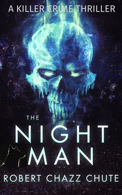
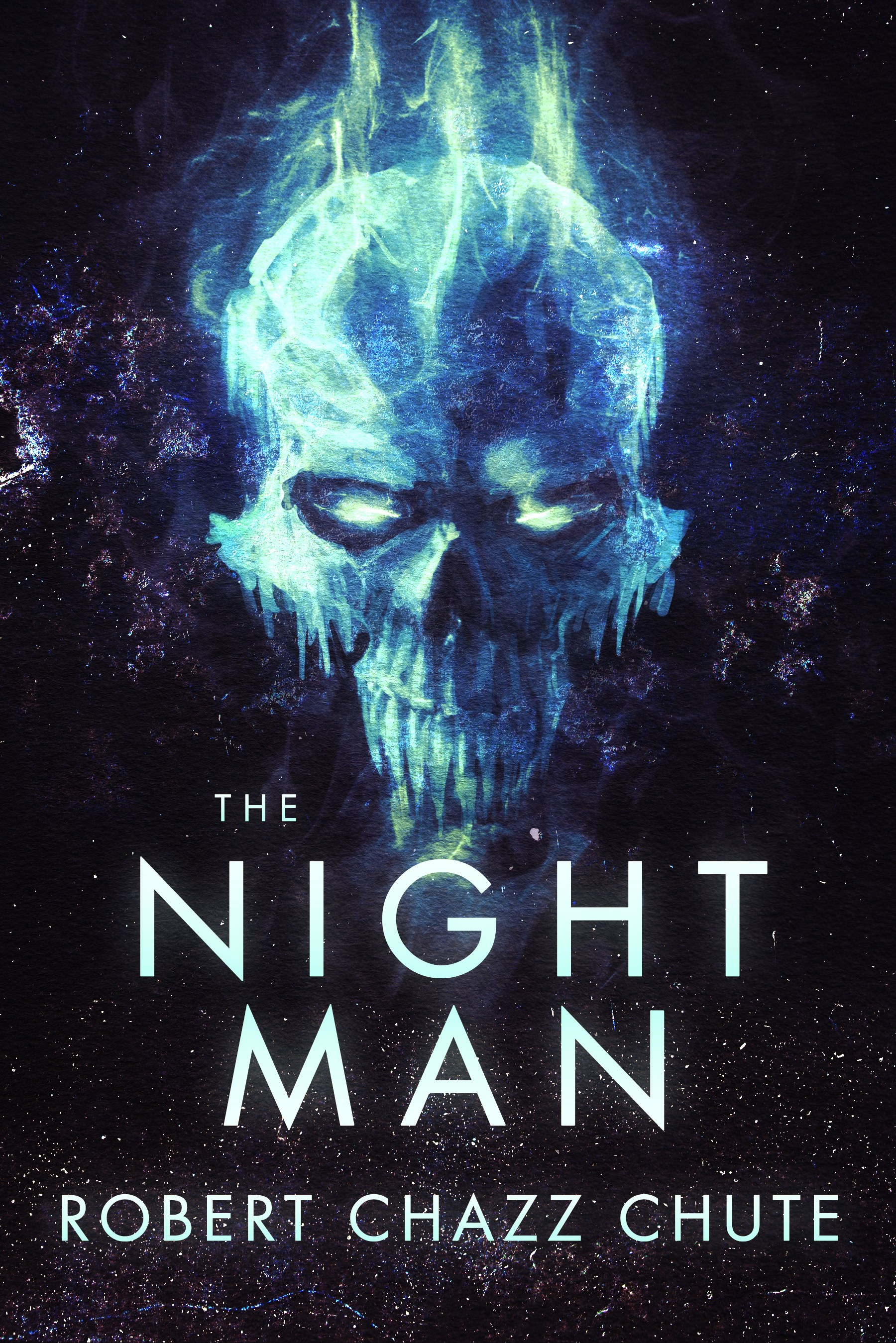
Too many books won’t be read, and not because they aren’t great. They don’t look good enough for a second glance. There are graphic design solutions. I just fired off an email to my solution, author and cover designer Kit Foster of KitFosterDesign.com. He sent me some samples of ideas for the cover of my upcoming plague thriller. One image was particularly strong and we’ll definitely go with some variation of that draft. You want great, not just good. Book covers are not easy. Unless you’re a graphic designer, get professional help with your cover. Maybe even then, you should outsource. Most authors who edit still need editors, so why don’t cover designers need another set of eyes on their book project?
Book art is hard to get right. With his first inkling about my book, Kit has already balanced out two opposing demands: We want readers to be struck by the uniqueness of the image on the one hand (and compelled by graphic design magic to buy, of course). However, the tone of the cover must also be so familiar that the reader will know intuitively and instantly to what genre the book belongs. Unique, yet familiar. Quite a feat, really, isn’t it? I’ve seen some indie authors insist they can do a DIY cover with PowerPoint. Looking at their cover art, I’m sorry, but I can’t agree. I want a cover that’s a delicious chocolate croissant, not a lentil and sewage burrito. I’m glad those writers can succeed despite their covers, but I’m sure they’d sell even more without the self-inflicted handicap of DIY delusion.
My discussion with Kit got me thinking again about what makes a great book cover. A solid title that grabs the
Click to get Bigger Than Jesus here
reader can make a difference. A recognizable name is bigger factor. If you have a bland, soundalike title (change it!) or haven’t broken through (yet), your best hope is a great cover image and hiring a graphic designer create it. As I’ve already confessed in this space, I experimented with DIY and I hurt myself. I’ve sold enough books in trad publishing that I know a good cover when I see one, but actually creating a decent book cover? Ha! No. I’m not the graphic designer. All hail Kit. He’s a book cover solution.
The problem I see with some book covers is they try to do too much at once. Covers are crammed, as if the author hopes the image will tell the whole story instead of giving the reader an intriguing taste and tease. It’s tempting to try that. I’ve almost succumbed myself, which is another reason to have a helmsman with a steady hand on the wheel to keep you from crashing into all those pretty icebergs. It’s tempting because, admit it, we still think we should pull in anybody and everybody who can read. In my opinion, that’s a mistake. I want readers who really love mystery and suspense mixed with witty repartee. All others need not apply because “all others” probably won’t like my books. That’s okay. You don’t like “music”. Our tastes are much more specific than that. You like neo-thrash synth-metal, industrial-Asian jazz fusion and Tom Jones singing It’s Not Unusual in a duet with the ghost of Tupac. Go after whatever your niche is. Instead of taking little bits from all over your plot and compressing them into a graphical soup, more specific, evocative and emotional images make compelling book cover art.
Please avoid a cover that only makes sense after you’ve read the entire book. The purpose of the cover is to seduce innocent virgins. Don’t require Holmesian cryptographic skills from people who aren’t even your readers yet. Before they are your readers, they are disinterested browsers. Convert them to actual readership with book covers that promise a secret revealed, invite them on a journey and make them hope for a braingasm. (Then deliver it when they actually buy it and read it.)
I see a lot of books where the author’s name is too small. That’s not an ego problem. That’s a branding problem. I understand how that happens. Readability is sacrificed so more elements can be crammed on the cover. It’s the Throw Everything at the Wall and Hope Something Sticks Approach. Take that cover down to thumbnail size and it’s not just readability that’s sacrificed, but legibility and sales. Kit goes with powerful, evocative images so we move toward covers that show and sell. I’m proud to be indie, but I want author name recognition in the long term. To do that, the cover has to look like a traditionally published cover. What’s common among trad published covers? Bigger author name tags.
For more on what makes a great cover, check out e-book cover design awards for insightful commentary that helps make better book covers and sells more books. Or just head over to Kit’s website and get going on your new book cover (or revamp an old one that isn’t selling. I did that with my DIY cover.) Kit Foster is a very helpful guy who does so much for authors at very reasonable rates. You’ve put so much work into your book. Give it a fighting chance to be read. Give your book, and all those virgins, a striking cover.
The input has been put in. By a huge majority, the votes are for the bright orange cover (below). When it’s on a shelf, digital or wooden, it will stand out. It was an interesting experiment to see how people reacted to the covers. The happy thing is that, even among people who weren’t so sure about the orange cover, most of them still thought that cover could be effective. The other aspect about book cover colors is a little more inside baseball: The rule of thumb is that, unless it’s a golf or gardening book, green covers don’t sell very well. (It’s one of those weird little details I learned from the Banff Publishing Workshop. It was reinforced by years of selling books for multiple publishers. I’m not sure about much, but that tidbit is pretty consistent except for The Celestine Prophecy.)
Soon you’ll be hearing from my graphic designer, Kit Foster of www.kitfosterdesign.com.Kit’s a novelist, too, and very talented. Someone told me the other day how impressed he was with Kit’s covers. They do look like they’re from a large publishing house, not my tiny kingdom of Ex Parte Press. We’re all told we shouldn’t judge a book by its cover, but we all do. Without a solid cover, no one will pick it up or click on it to discover the tasty treats inside.
The process of working with a graphic designer: When Kit and I started a dialogue about book covers, the arrangement evolved organically. I described what I had in mind and sent him a sample of the manuscript. He suggested a few things and I saw his wisdom and asked for some tweaks. He sent me a cover and we narrowed it down with another round or two or three of tweaks. His input was invaluable. I have no idea how he does what he does and I bowed to his experience with graphics. Even though I have a deep background in selling books, my focus was the words. Kit came up with the images to sell the words. With Sex, Drugs & Romeo, the final graphic is very close to his original proposal. With Sex, Death and Mind Control (for fun and profit), we went back and forth a bit more, but Kit was always patient and helpful. The only element I knew I wanted to keep was the author tag. I wanted it to be consistent across the bottom in cherry red on all the covers so my books would be instantly identifiable for cross-promotion purposes.
Kit’s great at what he does and a photographer friend of mine is also awesome. I’m going to ask them to guest post and drop some science on us about the art of book cover creation. In the meantime, rethink your green cover and ask for a poll from your network of writer friends and readers. People will often help if you dare to ask.