C h a z z W r i t e s . c o m

See all my books at AllThatChazz.com.

Great ebook cover design: More on what to look for

Our book covers must not sucketh.

But how do we make covers that blow readers away?

You don’t have to know how to make a cover to recognize a good one, but it helps to be guided in the principles of solid design by experts. Fortunately, I know a couple people whose art and instruction are incredibly helpful to authors and publishers.

Joel Friedlander’s ebook Cover Design Awards are here! 

Regular readers know my covers are magically manifested by Kit Foster of KitFosterDesign.com. Incredibly, Kit won another non-fiction design award for the second month in a row.

His previous winner was this little guide to Vine marketing by someone or other:

Click it to grab it. Just 99 cents!

How deliciously self-serving.

Congratulations to Kit, of course. Make sure you read all the comments on Joel’s site to cram all that good art learnin’ inside your brain box.

Filed under: awards, book marketing, ebooks, , , , , , , , , , , ,

Quote Art: A new way to promote your books

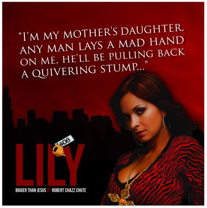
This is not a book cover. It’s Quote Art for my suspense novel, Bigger Than Jesus. The quote is pulled from the book. The art is by Kit Foster of KitFosterDesign.com.

Jesus Diaz is my luckless Cuban hit man in the first of the Hit Man Series: Bigger Than Jesus. (It’s pronounced “Hay-soose”.) Follow his exploits as he tries to escape New York’s Spanish mob with a fortune in stolen mafia money and the lovely Lily Vasquez.

Great book covers sell books. Now picture a quote pulled from your book with another compelling, related image. See it on Facebook, as a Twitpic, on your author site or as a poster at your next book signing. Quote Art is a different way to promote your books to new audiences. It’s a clue about your characters and another chance to intrigue potential readers. Why try to grab them with just one image when you can hold their attention with more using a new, integrated and savvy marketing tool?

Click it to grab the paperback or the ebook. Thanks!

Kit is my graphic designer. If you’re a regular reader, you know I’ve already sung his praises. Now I’m complimenting him for his innovation in doing something a little different to help me spread the word about my books. Thanks again, Kit!

To find out more about his book cover designs and to see samples of his art,

go to KitFosterDesign.com.

Want another marketing tool to build buzz?

I need a couple more volunteers for my Next Big Thing Blog Hop post. If you have a work in progress you want to build some buzz about, I have two more spots available for this event. All you have to do is answer ten quick questions about your WIP and post them on your blog a week from Wednesday. You link back to me and I link to you and the word spreads farther. Volunteer at expartepress@gmail.com and I’ll send you an email with the blog hop specs.

I’m doing another blog hop in the near future, so watch this space.

Filed under: publishing, , , , , , , , , , , , , , , , ,

Book cover troubles and solutions

Too many books won’t be read, and not because they aren’t great. They don’t look good enough for a second glance. There are graphic design solutions. I just fired off an email to my solution, author and cover designer Kit Foster of KitFosterDesign.com. He sent me some samples of ideas for the cover of my upcoming plague thriller. One image was particularly strong and we’ll definitely go with some variation of that draft. You want great, not just good. Book covers are not easy. Unless you’re a graphic designer, get professional help with your cover. Maybe even then, you should outsource. Most authors who edit still need editors, so why don’t cover designers need another set of eyes on their book project?

Book art is hard to get right. With his first inkling about my book, Kit has already balanced out two opposing demands: We want readers to be struck by the uniqueness of the image on the one hand (and compelled by graphic design magic to buy, of course). However, the tone of the cover must also be so familiar that the reader will know intuitively and instantly to what genre the book belongs. Unique, yet familiar. Quite a feat, really, isn’t it? I’ve seen some indie authors insist they can do a DIY cover with PowerPoint. Looking at their cover art, I’m sorry, but I can’t agree. I want a cover that’s a delicious chocolate croissant, not a lentil and sewage burrito. I’m glad those writers can succeed despite their covers, but I’m sure they’d sell even more without the self-inflicted handicap of DIY delusion.

My discussion with Kit got me thinking again about what makes a great book cover. A solid title that grabs the

Click to get Bigger Than Jesus here

reader can make a difference. A recognizable name is bigger factor. If you have a bland, soundalike title (change it!) or haven’t broken through (yet), your best hope is a great cover image and hiring a graphic designer create it. As I’ve already confessed in this space, I experimented with DIY and I hurt myself. I’ve sold enough books in trad publishing that I know a good cover when I see one, but actually creating a decent book cover? Ha! No. I’m not the graphic designer. All hail Kit. He’s a book cover solution.

The problem I see with some book covers is they try to do too much at once. Covers are crammed, as if the author hopes the image will tell the whole story instead of giving the reader an intriguing taste and tease. It’s tempting to try that. I’ve almost succumbed myself, which is another reason to have a helmsman with a steady hand on the wheel to keep you from crashing into all those pretty icebergs. It’s tempting because, admit it, we still think we should pull in anybody and everybody who can read. In my opinion, that’s a mistake. I want readers who really love mystery and suspense mixed with witty repartee. All others need not apply because “all others” probably won’t like my books. That’s okay. You don’t like “music”. Our tastes are much more specific than that. You like neo-thrash synth-metal, industrial-Asian jazz fusion and Tom Jones singing It’s Not Unusual in a duet with the ghost of Tupac. Go after whatever your niche is. Instead of taking little bits from all over your plot and compressing them into a graphical soup, more specific, evocative and emotional images make compelling book cover art.

Please avoid a cover that only makes sense after you’ve read the entire book. The purpose of the cover is to seduce innocent virgins. Don’t require Holmesian cryptographic skills from people who aren’t even your readers yet. Before they are your readers, they are disinterested browsers. Convert them to actual readership with book covers that promise a secret revealed, invite them on a journey and make them hope for a braingasm. (Then deliver it when they actually buy it and read it.)

I see a lot of books where the author’s name is too small. That’s not an ego problem. That’s a branding problem. I understand how that happens. Readability is sacrificed so more elements can be crammed on the cover. It’s the Throw Everything at the Wall and Hope Something Sticks Approach. Take that cover down to thumbnail size and it’s not just readability that’s sacrificed, but legibility and sales. Kit goes with powerful, evocative images so we move toward covers that show and sell. I’m proud to be indie, but I want author name recognition in the long term. To do that, the cover has to look like a traditionally published cover. What’s common among trad published covers? Bigger author name tags.

For more on what makes a great cover, check out e-book cover design awards for insightful commentary that helps make better book covers and sells more books. Or just head over to Kit’s website and get going on your new book cover (or revamp an old one that isn’t selling. I did that with my DIY cover.) Kit Foster is a very helpful guy who does so much for authors at very reasonable rates. You’ve put so much work into your book. Give it a fighting chance to be read. Give your book, and all those virgins, a striking cover.

The paperback has arrived. For $9.99. Did you hear that? Distant thunder of the Book Gods mumbling to each other. Oooh, shivers!

Filed under: publishing, , , , , , , , , , , , , , , ,

Author Blog Challenge 17: How to talk with your graphic designer about your book cover

Well, not your graphic designer. I can only say how I talk to my graphic designer, but I think new authors might benefit from pulling back the curtain on the process. Everybody’s a little nervous the first time they outsource a book cover, but this guy makes it easy and I recommend him. As you’ll see below, I’m going to come across as a bit of a pain in the ass in this post.

Indie author and graphic designer extraordinaire Kit Foster of Kit Foster Design creates my covers. I can’t create a good cover to save my life, but I can recognize a good one. There are certain things that are pretty easy up front: cookbooks need phat, fat, sexy food (and a thin celebrity chef on the cover); green books don’t sell unless they’re about golf or lawn care; ugly isn’t different in a good way, it’s merely ugly and won’t sell. I worked as a sales rep for several publishing companies and got so I can recognize a bad dog. That said, I have no idea how Kit does his magic to create covers (magic herbs and tattooed Scottish elves are involved), but my covers look like they could have been produced in a traditional publishing house because Kit is the go-to guy.

I rarely come to Kit with an idea for the cover image. Instead I tell him about the book or send him some chapters or the whole thing (depending what stage I’m at with the book.) I trust Kit immensely because, when I’m in revisions, I really don’t want anyone to see it before I’m done and a red bow is tied around the manuscript.

What follows are excerpts from our emails (used with Kit’s permission, of course) to give you the gist of how the Bigger Than Jesus cover came to be, what I was looking for and how we arrived where we did. There were actually at least a dozen or so emails back and forth over a month because Kit supplied new art for my podcast and whipped up a cover for the non-fiction book I have in the works. Kit will use the new covers to update the banner for my author site, too. He’s a multi-talented fellow. That and we keep each other up to date on how we’re doing. Find allies, folks. Friends and coffee are critical.

My initial email about the Bigger Than Jesus cover:
Hi Kit,
 I finished Bigger Than Jesus. I have some work to do yet on the manuscript. Uncharacteristically, I’m coming to you with an idea that I think will work for the cover and it’s kind of a John Locke cover (or a James Bond book cover from the ’80s.)
 
The story: Bigger Than Jesus revolves around Jesus Diaz, a Cuban hit man who wants out of the mob. There’s gunplay and a lot of duplicity and twists. Every chapter has a twist or an aha moment. At the heart of the story is a key to storage locker #408 with millions of dollars in it which could fuel Jesus’s escape and that of and his girlfriend, Lily Vasquez. Jesus doesn’t just love Lily. He worships her. <Spoilers deleted.> It’s kind of a Coen brothers movie in that whatever Jesus does… at every turn he’s thwarted.
 
She Who Must Be Obeyed suggested this idea for a cover: We need a gorgeous Latina for Lily. In one hand she holds a key (to a padlock) labeled 408. In the other hand, a SIG Sauer 225 (Jesus’s handgun) or a Beretta if you prefer. And around this gorgeous woman’s neck? A big gold cross hanging by a thick gold chain. Think Madonna/High Catholic ornate for this. Title: Bigger Than Jesus. Author tag: Robert Chazz Chute in my usual cherry red. I’ll just need an ebook cover to start but I’ll be needing a full front/spine/back cover for the paperback as well soonish.
 
I sent you a link to an article about making the author’s name bigger. As this is a thriller and I’m trying to build a brand for a series, I’d like to try that. I can always switch it up later, but let’s try big author name up top to make it look more brandy, less indie, more swagger. What do you think of that idea?
Ideas get bandied about. Kit does other work for me. Then:
Hi Chazz,
…as discussed, I’m attaching a few drafts of Bigger Than Jesus (covers) for you to have a look at…Sorry there are so many drafts, but it should at least give you a little variety. Of course, as well, at this stage they’re all pretty rough. As ever, if none of them are suitable, I’m more than happy to go back to the drawing board.
Note: Any of the covers Kit sent me, and there were six in total, would have been pretty great to great, but Kit is patient and doesn’t mind fine tuning. Sorry I can’t show you the other covers to see what I’m talking about and to compare, but the draft covers are proprietary until they’re paid for. My break down gives you a hint, though:
Kit! My man!

Whee! This is exciting! Bigger Than Jesus II.png has a nice Pulp Fiction feel. Bigger Than Jesus III.png is closer to what I was picturing to begin with and the model is awesome. I wish we had the model from Bigger Than Jesus III.png in the pose from Bigger Than Jesus IV.png. Bigger Than Jesus I (blur).png has a movie poster vibe, though I like the colours in the next, more cartoonish variation. But, the winner is…I think we should go with a variation on the last one, Bigger Than Jesus IV.png. 

So here are my thoughts for the variation on Bigger Than Jesus IV.png: 
1. Put my name at the top and bump up the size. Please put the title where the author tag is, not at the bottom. 
2. Love the key. Can we make the key shiny gold? 
3. Love the model. Can we make the cross she’s wearing gold and or bigger so it pops out? Hard to make it out as is. Too bad she’s not wearing red. Do you think we could make the gun gold as well so it pops? (Either that or lighten the background a little so we see the gun better? I’m worried the awesomeness of the cover will be lost at thumbnail size.) I’m playing off the Jesus-thing obviously, but I also don’t want anyone to actually think it’s a religious book. I want them to be intrigued with the juxtaposition of the gun and the word Jesus. As is, I think potential readers might skip over it if the “Jesus” pops out quite as much as it does.
4. Also, with the girl in the centre, can we make her any bigger? I think Bigger Than Jesus III.png will at least be the alternative cover for the future just as it is. 
5. I think the gold accents of the key, the gun and the cross will really make it pop. 
Doable? Thoughts?
Kit sent me the revised draft that was close, but I was still worried:
 
Hi Kit!

 We’re getting there. This looks pretty good, but I’m concerned it’s too dark. Especially at thumbnail size, I don’t think the image will show up well enough. Can we go with a lighter background and make the cross and key even brighter gold so they pop like the gun, please? I don’t mind if the shine is so bright it’s unrealistic (i.e. think Man with the Golden Gun movie poster.) The shinier the better. And a question: When I find someone to give me a cover blurb for this, do we just scale down the title a little bit so we can fit it in somewhere?
 Thanks, man. (Hey, she looks better in the red dress!)
And finally, by Thor I’m hard to please, but Kit is patient:
Hi Kit,

 Better, but I’m thinking the answer for this cover is more contrast. Up for an experiment? What if we make the background white and the text black or maybe cherry red? Can the cross be a shinier gold, or bigger, or both? The cross is still getting lost. I think it will pop more this way.
Success! Though we went for a white background in the end, Kit added a black frame which was not present in earlier drafts. White backgrounds tend to look lost in the retail catalogue if they don’t have a defined edge. Amazon takes .tiffs and jpegs, so Kit sent me a cleaned up version where he edited the fine points on the image I’ll never know about. That’s for the tattooed Scottish elves and Kit to know about.
This was the most protracted back and forth we’ve had over one cover, mostly because I’m picky and kept asking, “What if we made the key and cross so shiny the reader actually gouged out their own eyes to stop the searing pain in their retinas?” By contrast, the art for my book on writing (TBA) came together very quickly. Kit sent me four or five variations of the cover for that book and I pretty much just picked one and that was it, right out of the gate.) If you’re thinking you need a graphic artist for your book, I can’t sing loud enough about the powers of The Kit.
Oh, and here’s the cover. I love it.

Here’s the final draft of the Bigger Than Jesus cover.

Filed under: publishing, , , , , , , , , , ,

What moves books? And what is ‘Parketing’ anyway?

Successful book marketing campaigns often do a lot of things at once, especially at first, before awareness of your book grows. Author Jeff Bennington, for instance, has noticed that online marketing of his books takes an hour out of each day or sales begin to dip. (More on getting you and your books’ global fame in a minute, but first let’s talk attitudes, parketing and my terrible personal deficiencies as a book marketer.)

Someone’s already saying, “An hour a day? Who has that kind of time? When will I have time to write?” You’re an artist, but you’re an artist in business. Businesses need to advertise. You’d make time to send out invoices, so make time to make people aware of your books unless you’re content writing for yourself and your kids. (Fortunately, lots of online marketing is cheap, free and fun, so there’s that.) Down the road, once you reach critical mass, maybe you’ll be able to get away with doing less marketing, but I doubt it. Coke still advertises. Manage your time and make it work.

Here’s one cheap way to promote local awareness of your books: I first heard of parketing (though it wasn’t called that then) at a writers’ conference three years ago. The marketing guru fired lots of ideas at us: blogging, tweeting, podcasts…the usual, though it was all newer, scarier stuff then. Then the guru asked, “How many of you have a car magnet advertising the cover of your book?” Not a single hand was raised, of course. The marketing guru snarked, “Yeah, why would you want to let anyone know you have a book for sale?” Park your car where lots of people will see it with your lovely book cover on it and voilà! That’s parketing.

It’s a digital world, so old-school attempts to market a book are often overlooked, often with justification. However, you may want to consider parketing in certain circumstances. This is one of those advertising strategies that has “short term” written all over it. It could work for the short term because no one is doing it. No one is doing it because your first reaction is that it sounds silly or maybe even naive or worse, beneath your dignity. If you habitually park your car in a high-visibility area (say, outside a bookstore at the mall) it sounds a little less silly. When you consider the number of businesses that do advertise this way, successfully, it sounds even less nuts. If your pockets are shallow, you can still do this. I got my car magnet from Vistaprint for less than $20.

Parketing works much better if you’re prepared to ask a bunch of friends to put car magnets on their vehicles, too. If your pockets are very deep, you could even go for the full paint job. Do that and you’ve got a marketing campaign started in your city and the basis for a press release to local newspapers and magazines. Sure, we market our ebooks globally, but we shouldn’t turn up our noses at getting noticed locally. That’s one way to get critical mass going. People in your own city, especially media, are more interested in local authors because they have a sense of ownership and familiarity with local authors. There’s a business in my city that seems to be everywhere because each employee gets a free paint job on their vehicle advertising the business. Everywhere they drive, they are advertising. It’s not that large a company (or even a particularly good one), but their ad-plastered cars seem ubiquitous, reminding everyone daily, “Here we are!”

The ad on my van gets attention because it’s just so damn weird. There is surely not another author advertising his or her book with a car magnet for hundreds of miles, so people slow down to read it. I’ve watched them slow down to look. Has it translated to sales? I don’t know. It’s just one car magnet for one book, but I do know people are reading the ad. For me, this little strategy is really  just about promoting awareness so I get my name familiar. For what I spent, I’m okay with that. We gravitate toward the familiar, buying name brands instead of the unknown product (which could be just as good or better but you don’t recognize the label.) When I shop the local Asian food market, I’m actually physically uncomfortable with the cans of unknown weird stuff even though I know it’s not weird. It’s merely different. (I’m weird.)

It’s all the other stuff I do that will make the difference in the long term. There is no one way to move books. Online marketing is going to do much more  because it’s everywhere. For instance, I’ve been on the air, or talked about, on six different podcasts recently (besides my own weekly podcast). That will go a lot further toward gaining some vague familiarity with my name as an author than a car magnet will for one book. Plus, I love podcasting, so I’ll always have that.

Have you guessed this post is not really about putting a magnet on your car? It’s about using multiple strategies to get attention to your books. Marketing campaigns that are single-pronged attacks do not move books. Try a lot of things, even the weird ideas if they make sense to you. Experiment and have fun with it if you can. Try to get your name out there, arriving from several places, preferably at once. We must reach outside of our circles of family and friends to move books.

I’m often reluctant to try new book marketing  strategies until I see them tested by others. That’s why I missed out on the benefit of KDP Select while some others made whacko cash last December. I haven’t jumped on Pinterest because I read one blog about their scary terms of service. These are my deficiencies. I’m often too timid about doing things that are good for me. Everything new feels weird at first. Unfamiliar doesn’t mean wrong. Unfamiliar simply means unfamiliar. In our marketing efforts, should we proceed with caution? Sure. Don’t get taken,  but do proceed and make progress.

What are the book marketing basics? Write a good book. Get it edited. Get a great cover design. Price it right. Yeah, yeah, yeah. You know all that.

What then? Then go buy my buddy Jeff Bennington’s new book, The Indie Author’s Guide to the Universe. I’m reading it right now and I especially like the things you can do to sell your books that are free. Let him show you the way forward. The best marketing strategies are not static. They come and go and rise and fall so we have to stay current and open to experimentation with new opportunities as they arise.

That’s what I’m trying to do, anyway, and that’s what this blog is about.

~ Robert Chazz Chute is the author of a bunch of great ebooks of suspense with titles he now realizes generally repel you. He podcasts a comedy/narrative show, Self-help for Stoners, every Thursday night. To learn more, go to AllThatChazz.com.

Filed under: ebooks, Media, My fiction, podcasts, Publicity & Promotion, publishing, Useful writing links, web reviews, What about Chazz?, What about you?, writing tips, , , , , , , , , , , , , , , , ,

On judging books by their covers

Thank you to everyone for your input on the covers for my book, Self-help for Stoners, Stuff to Read When You’re High (available on all e-readers Nov. 1, cha-cha-cha!)

The input has been put in. By a huge majority, the votes are for the bright orange cover (below). When it’s on a shelf, digital or wooden, it will stand out. It was an interesting experiment to see how people reacted to the covers. The happy thing is that, even among people who weren’t so sure about the orange cover, most of them still thought that cover could be effective. The other aspect about book cover colors is a little more inside baseball: The rule of thumb is that, unless it’s a golf or gardening book, green covers don’t sell very well.  (It’s one of those weird little details I learned from the Banff Publishing Workshop. It was reinforced by years of selling books for multiple publishers. I’m not sure about much, but that tidbit is pretty consistent except for The Celestine Prophecy.) 

Soon you’ll be hearing from my graphic designer, Kit Foster of www.kitfosterdesign.com. Kit’s a novelist, too, and very talented. Someone told me the other day how impressed he was with Kit’s covers. They do look like they’re from a large publishing house, not my tiny kingdom of Ex Parte Press. We’re all told we shouldn’t judge a book by its cover, but we all do. Without a solid cover, no one will pick it up or click on it to discover the tasty treats inside.

The process of working with a graphic designer: When Kit and I started a dialogue about book covers, the arrangement evolved organically. I described what I had in mind and sent him a sample of the manuscript. He suggested a few things and I saw his wisdom and asked for some tweaks. He sent me a cover and we narrowed it down with another round or two or three of tweaks. His input was invaluable. I have no idea how he does what he does and I bowed to his experience with graphics. Even though I have a deep background in selling books, my focus was the words. Kit came up with the images to sell the words. With Sex, Drugs & Romeo, the final graphic is very close to his original proposal. With Sex, Death and Mind Control (for fun and profit), we went back and forth a bit more, but Kit was always patient and helpful. The only element I knew I wanted to keep was the author tag. I wanted it to be consistent across the bottom in cherry red on all the covers so my books would be instantly identifiable for cross-promotion purposes.

Kit’s great at what he does and a photographer friend of mine is also awesome. I’m going to ask them to guest post and drop some science on us about the art of book cover creation. In the meantime, rethink your green cover and ask for a poll from your network of writer friends and readers. People will often help if you dare to ask.

Filed under: Books, ebooks, self-publishing, What about Chazz?, , , , , , , , , , , ,

Bestseller with over 1,000 reviews!
Winner of the North Street Book Prize, Reader's Favorite, the
Literary Titan Award, the Hollywood Book Festival, and the
New York Book Festival.

http://mybook.to/OurZombieHours
A NEW ZOMBIE ANTHOLOGY

Winner of Writer's Digest's 2014 Honorable Mention in Self-published Ebook Awards in Genre

The first 81 lessons to get your Buffy on

More lessons to help you survive Armageddon

"You will laugh your ass off!" ~ Maxwell Cynn, author of Cybergrrl

Available now!

Fast-paced terror, new threats, more twists.

An autistic boy versus our world in free fall

Suspense to melt your face and play with your brain.

Action like a Guy Ritchie film. Funny like Woody Allen when he was funny.

Jesus: Sexier and even more addicted to love.

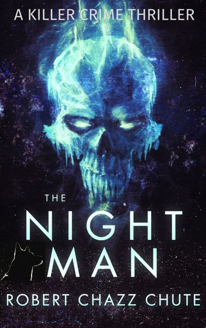
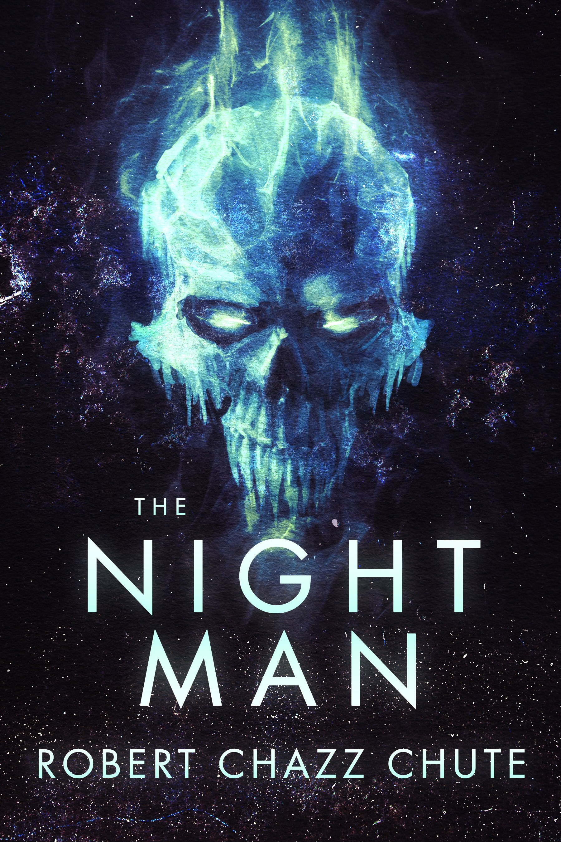
You can pick this ebook up for free today at this link: http://bit.ly/TheNightMan

Join my inner circle at AllThatChazz.com

See my books, blogs, links and podcasts.

Enter your email address to follow this blog and receive notifications of new posts by email.

Join 9,217 other subscribers