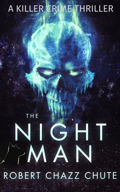
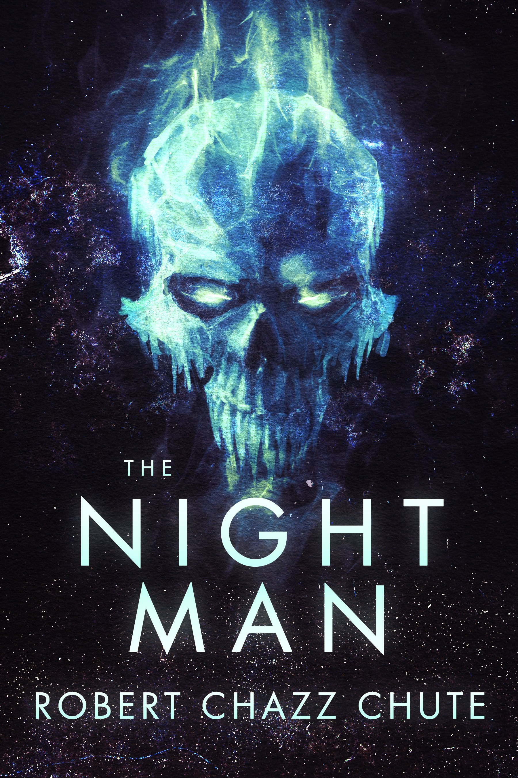
Too many books won’t be read, and not because they aren’t great. They don’t look good enough for a second glance. There are graphic design solutions. I just fired off an email to my solution, author and cover designer Kit Foster of KitFosterDesign.com. He sent me some samples of ideas for the cover of my upcoming plague thriller. One image was particularly strong and we’ll definitely go with some variation of that draft. You want great, not just good. Book covers are not easy. Unless you’re a graphic designer, get professional help with your cover. Maybe even then, you should outsource. Most authors who edit still need editors, so why don’t cover designers need another set of eyes on their book project?
Book art is hard to get right. With his first inkling about my book, Kit has already balanced out two opposing demands: We want readers to be struck by the uniqueness of the image on the one hand (and compelled by graphic design magic to buy, of course). However, the tone of the cover must also be so familiar that the reader will know intuitively and instantly to what genre the book belongs. Unique, yet familiar. Quite a feat, really, isn’t it? I’ve seen some indie authors insist they can do a DIY cover with PowerPoint. Looking at their cover art, I’m sorry, but I can’t agree. I want a cover that’s a delicious chocolate croissant, not a lentil and sewage burrito. I’m glad those writers can succeed despite their covers, but I’m sure they’d sell even more without the self-inflicted handicap of DIY delusion.
My discussion with Kit got me thinking again about what makes a great book cover. A solid title that grabs the

Click to get Bigger Than Jesus here
reader can make a difference. A recognizable name is bigger factor. If you have a bland, soundalike title (change it!) or haven’t broken through (yet), your best hope is a great cover image and hiring a graphic designer create it. As I’ve already confessed in this space, I experimented with DIY and I hurt myself. I’ve sold enough books in trad publishing that I know a good cover when I see one, but actually creating a decent book cover? Ha! No. I’m not the graphic designer. All hail Kit. He’s a book cover solution.
The problem I see with some book covers is they try to do too much at once. Covers are crammed, as if the author hopes the image will tell the whole story instead of giving the reader an intriguing taste and tease. It’s tempting to try that. I’ve almost succumbed myself, which is another reason to have a helmsman with a steady hand on the wheel to keep you from crashing into all those pretty icebergs. It’s tempting because, admit it, we still think we should pull in anybody and everybody who can read. In my opinion, that’s a mistake. I want readers who really love mystery and suspense mixed with witty repartee. All others need not apply because “all others” probably won’t like my books. That’s okay. You don’t like “music”. Our tastes are much more specific than that. You like neo-thrash synth-metal, industrial-Asian jazz fusion and Tom Jones singing It’s Not Unusual in a duet with the ghost of Tupac. Go after whatever your niche is. Instead of taking little bits from all over your plot and compressing them into a graphical soup, more specific, evocative and emotional images make compelling book cover art.
Please avoid a cover that only makes sense after you’ve read the entire book. The purpose of the cover is to seduce innocent virgins. Don’t require Holmesian cryptographic skills from people who aren’t even your readers yet. Before they are your readers, they are disinterested browsers. Convert them to actual readership with book covers that promise a secret revealed, invite them on a journey and make them hope for a braingasm. (Then deliver it when they actually buy it and read it.)
I see a lot of books where the author’s name is too small. That’s not an ego problem. That’s a branding problem. I understand how that happens. Readability is sacrificed so more elements can be crammed on the cover. It’s the Throw Everything at the Wall and Hope Something Sticks Approach. Take that cover down to thumbnail size and it’s not just readability that’s sacrificed, but legibility and sales. Kit goes with powerful, evocative images so we move toward covers that show and sell. I’m proud to be indie, but I want author name recognition in the long term. To do that, the cover has to look like a traditionally published cover. What’s common among trad published covers? Bigger author name tags.
For more on what makes a great cover, check out e-book cover design awards for insightful commentary that helps make better book covers and sells more books. Or just head over to Kit’s website and get going on your new book cover (or revamp an old one that isn’t selling. I did that with my DIY cover.) Kit Foster is a very helpful guy who does so much for authors at very reasonable rates. You’ve put so much work into your book. Give it a fighting chance to be read. Give your book, and all those virgins, a striking cover.

The paperback has arrived. For $9.99. Did you hear that? Distant thunder of the Book Gods mumbling to each other. Oooh, shivers!
Filed under: publishing, Author, Bigger than Jesus, book, book art, Book cover, books, Cover art, Do it yourself, Graphic design, graphic designer, illustration, Kit Foster, kitfosterdesign.com, Literature, Robert Chazz Chute, what makes a good book cover