C h a z z W r i t e s . c o m

See all my books at AllThatChazz.com.

Pulp fiction doesn’t have to sound like pulp fiction

A friend of mine has a strict rule about writing: “Remove it from the manuscript if it sounds like writing.”

Writerly = Bad

Some sentences do call attention to themselves. It’s not supposed to be a good thing, but I don’t think it should be an unbending rule. To me, it’s a guideline reminding me that story always comes first (but we should enjoy ourselves along the way.) It’s up to the creator to make an informed choice about the narrative and the reader will decide if they groove on that choice.

In film, sometimes a director will take you out of the movie’s illusion by putting the camera somewhere unexpected, lingering, shaking or going for some special effect that reminds the observer, “Hey! You’re watching a movie!”

That can happen when you write something in such a way that it reminds the reader,

“Hey! You’re reading a book!”

Maybe the prose is beautiful, but some will accuse you of writing purple prose, being too precious or being maudlin. But many readers aren’t just readers. The best readers are also lovers of language. They want the reading experience to transcend mere delivery of information. When they read your writerly passage, it transports them.

I write a lot of action scenes, but I make sure to balance out the action with pauses so the reader can catch her breath before being thrown into the next chasm.

We’re pushed to begin in the middle of the action and make the pace fast. However, too many beats in too short a time sacrifices character development. Lose that, and we don’t care about the action scene.

Dare to go deeper so the bad guys don’t devolve into “Heavy #1” and “Heavy #2” come through the door with guns. You may or not remember details of the scene in Pulp Fiction where John Travolta and Samuel L. Jackson take down the guys who stole from their boss. However, film buffs can recite the lines from the drive to the shoot out. Remember? “Royale with cheese.”

Take time to build tension. There are scenes (yes, even in novels about the zombie apocalypse) that pause to show how people and their relationships are changing. Sometimes the pause is a great chance to write something for comedic effect. If you can make them laugh on one page and cry on the next, they’ll love the story more.

We can use our words to communicate the power and depth of the ocean and of personalities. We can show happiness and tragedy in a few brush strokes or we can dare to go deeper sometimes, reaching for the uneasy metaphor. Readers appreciate a story that explores emotional range with developed characters they care about.

My friend, the hardliner, says, “Never sound writerly!”

“But dude!” I replied, “Sometimes it’s only the elegant turns of phrase readers remember. It’s the flourish that captures the detail that makes the scene memorable. Without a little reach in description, I feel like I may as well be tapping out the story on a telegraph.”

“You’re just writing a zombie novel,” he said. “That’s not what they’re expecting.”

“No book has to be just anything. Any writing can turn the dial up to eleven and sound epic with the right twist on the expected. We aren’t supposed to give them what they expect. That’s mundane.”

“Okay,” he said, “just don’t make it sound too writerly. You know what I mean.”

“I promise I’ll delete it if it’s too obscure or gets in the way of the story.”

Mostly, I keep my promises.

Filed under: writing tips, , , , , , , , , , , , ,

Author Blog Challenge 18: The Top Ten Reasons You (yes! You!) Crave This Book

Please click here to get Bigger Than Jesus

To whom will Bigger Than Jesus appeal? I have serious and much less than serious answers to this Author Blog Challenge writing prompt:

1. People who like a fast beach read of a crime thriller that’s hard to put down. I got the idea for my pacing from Blake Crouch’s Run. There’s a cliffhanger or an aha moment, or several, in every chapter. The tension only cranks up.

2. People who like old caper movies, like To Catch a Thief, Sneakers or The Italian Job. My fondest childhood memories are getting lost in movies to shut out everything else.

3. People who like Coen brothers‘ movies where simple solutions lead to more and more complex problems and the hero is thwarted again and again. Rock? Meet hard place. And now a badger is chewing your jugular as you try to do your taxes.

4. People who like funny, punchy dialogue, including a debate between two hoods: Who shot first, Han Solo or Greedo? (Yes, that’s one of the serious answers and the question does bear on the action at the time.)

5. People who like a lot of twists and surprises. I modelled my plot after screenwriter and author William Goldman‘s penchant for sucker punches where, just when you think you know what happens next, it goes a different way.

6. People who value clever more than gory. For a book about a hit man trying to escape the mob, there’s a lot of word play and when the violence does occur, it’s realistic yet somehow funny in the same way Pulp Fiction could be. The chapters skip along with logical complexity offset by humour.

7. People who like genre fiction that reaches up. Much of the novel has a lighthearted slant, but underneath, when you discover some of the main character’s history, it’s unexpectedly disturbing and heartbreaking. Are you worried I’ve just spoiled  something? Don’t be. I like magic tricks in all of my fiction. I’m telling you up front that I’m going to deceive you and you’re going to watch to catch me at my sleight of hand. The game is, I’m still going to fool you anyway. “Consider the gauntlet thrown,” he said smiling. I know this will work because I often surprised myself while writing Bigger Than Jesus.

8. Movie buffs with an Elmore Leonard sensibility in their reading tastes. Jesus Diaz, the anti-hero of the novel, is a movie buff and, since movies were a large part of his education, he sees the world through a Hollywood lens. The action is definitely influenced by Elmore Leonard’s take on shady characters having strange dialogue.

9. Readers who like a book that plays with them. The entire book is written in present tense, second-person. I loved Bright Lights, Big City for that and I decided that, after twenty-seven years, somebody should try that again. But it’s not just my personal preference or a gimmick at work. There’s a reason. Late in the novel, you get a strong hint as to why the narrative is told as it is.

10. Readers who enjoy a story that ends up in some unexpected places, like a discussion of Salvador Dali’s life, for instance. Bigger Than Jesus is a fun game and a puzzle box of a crime thriller that packs serious emotions behind it.

Some of the less serious answers to this Author Blog Challenge writing prompt include: Everyone with a Kindle or anyone who gets the free Kindle Reading app for any device, NMD (Not my dad), people who enjoy breathing, gorgeous and empowered Latinas, New York pizza joint owners who bought it thinking it was about Jesus Christ but will get sucked in anyway, criminals plotting to go straight, intelligent people (so if you don’t get it…eh, you figure it out), Beatles fans who also love the SIG Sauer, and the authorities who put me on a watch list for my Google searches because of the research for this book.

The second part of the writing prompt asked: How do I connect with them to market to them?

Um. I’m not sure. Have I convinced you yet?

Click the book cover if yes.

GET BIGGER THAN JESUS

If not, send me your email address at expartepress@gmail.com.

Maybe I’ll come to your house.

Maybe I’ll send you something in the mail.

Maybe you’ll wake up hanging upside down.

We’ll work it out.

Filed under: publishing, , , , , , , , , , , , , , , , , , ,

Author Blog Challenge 17: How to talk with your graphic designer about your book cover

Well, not your graphic designer. I can only say how I talk to my graphic designer, but I think new authors might benefit from pulling back the curtain on the process. Everybody’s a little nervous the first time they outsource a book cover, but this guy makes it easy and I recommend him. As you’ll see below, I’m going to come across as a bit of a pain in the ass in this post.

Indie author and graphic designer extraordinaire Kit Foster of Kit Foster Design creates my covers. I can’t create a good cover to save my life, but I can recognize a good one. There are certain things that are pretty easy up front: cookbooks need phat, fat, sexy food (and a thin celebrity chef on the cover); green books don’t sell unless they’re about golf or lawn care; ugly isn’t different in a good way, it’s merely ugly and won’t sell. I worked as a sales rep for several publishing companies and got so I can recognize a bad dog. That said, I have no idea how Kit does his magic to create covers (magic herbs and tattooed Scottish elves are involved), but my covers look like they could have been produced in a traditional publishing house because Kit is the go-to guy.

I rarely come to Kit with an idea for the cover image. Instead I tell him about the book or send him some chapters or the whole thing (depending what stage I’m at with the book.) I trust Kit immensely because, when I’m in revisions, I really don’t want anyone to see it before I’m done and a red bow is tied around the manuscript.

What follows are excerpts from our emails (used with Kit’s permission, of course) to give you the gist of how the Bigger Than Jesus cover came to be, what I was looking for and how we arrived where we did. There were actually at least a dozen or so emails back and forth over a month because Kit supplied new art for my podcast and whipped up a cover for the non-fiction book I have in the works. Kit will use the new covers to update the banner for my author site, too. He’s a multi-talented fellow. That and we keep each other up to date on how we’re doing. Find allies, folks. Friends and coffee are critical.

My initial email about the Bigger Than Jesus cover:
Hi Kit,
 I finished Bigger Than Jesus. I have some work to do yet on the manuscript. Uncharacteristically, I’m coming to you with an idea that I think will work for the cover and it’s kind of a John Locke cover (or a James Bond book cover from the ’80s.)
 
The story: Bigger Than Jesus revolves around Jesus Diaz, a Cuban hit man who wants out of the mob. There’s gunplay and a lot of duplicity and twists. Every chapter has a twist or an aha moment. At the heart of the story is a key to storage locker #408 with millions of dollars in it which could fuel Jesus’s escape and that of and his girlfriend, Lily Vasquez. Jesus doesn’t just love Lily. He worships her. <Spoilers deleted.> It’s kind of a Coen brothers movie in that whatever Jesus does… at every turn he’s thwarted.
 
She Who Must Be Obeyed suggested this idea for a cover: We need a gorgeous Latina for Lily. In one hand she holds a key (to a padlock) labeled 408. In the other hand, a SIG Sauer 225 (Jesus’s handgun) or a Beretta if you prefer. And around this gorgeous woman’s neck? A big gold cross hanging by a thick gold chain. Think Madonna/High Catholic ornate for this. Title: Bigger Than Jesus. Author tag: Robert Chazz Chute in my usual cherry red. I’ll just need an ebook cover to start but I’ll be needing a full front/spine/back cover for the paperback as well soonish.
 
I sent you a link to an article about making the author’s name bigger. As this is a thriller and I’m trying to build a brand for a series, I’d like to try that. I can always switch it up later, but let’s try big author name up top to make it look more brandy, less indie, more swagger. What do you think of that idea?
Ideas get bandied about. Kit does other work for me. Then:
Hi Chazz,
…as discussed, I’m attaching a few drafts of Bigger Than Jesus (covers) for you to have a look at…Sorry there are so many drafts, but it should at least give you a little variety. Of course, as well, at this stage they’re all pretty rough. As ever, if none of them are suitable, I’m more than happy to go back to the drawing board.
Note: Any of the covers Kit sent me, and there were six in total, would have been pretty great to great, but Kit is patient and doesn’t mind fine tuning. Sorry I can’t show you the other covers to see what I’m talking about and to compare, but the draft covers are proprietary until they’re paid for. My break down gives you a hint, though:
Kit! My man!

Whee! This is exciting! Bigger Than Jesus II.png has a nice Pulp Fiction feel. Bigger Than Jesus III.png is closer to what I was picturing to begin with and the model is awesome. I wish we had the model from Bigger Than Jesus III.png in the pose from Bigger Than Jesus IV.png. Bigger Than Jesus I (blur).png has a movie poster vibe, though I like the colours in the next, more cartoonish variation. But, the winner is…I think we should go with a variation on the last one, Bigger Than Jesus IV.png. 

So here are my thoughts for the variation on Bigger Than Jesus IV.png: 
1. Put my name at the top and bump up the size. Please put the title where the author tag is, not at the bottom. 
2. Love the key. Can we make the key shiny gold? 
3. Love the model. Can we make the cross she’s wearing gold and or bigger so it pops out? Hard to make it out as is. Too bad she’s not wearing red. Do you think we could make the gun gold as well so it pops? (Either that or lighten the background a little so we see the gun better? I’m worried the awesomeness of the cover will be lost at thumbnail size.) I’m playing off the Jesus-thing obviously, but I also don’t want anyone to actually think it’s a religious book. I want them to be intrigued with the juxtaposition of the gun and the word Jesus. As is, I think potential readers might skip over it if the “Jesus” pops out quite as much as it does.
4. Also, with the girl in the centre, can we make her any bigger? I think Bigger Than Jesus III.png will at least be the alternative cover for the future just as it is. 
5. I think the gold accents of the key, the gun and the cross will really make it pop. 
Doable? Thoughts?
Kit sent me the revised draft that was close, but I was still worried:
 
Hi Kit!

 We’re getting there. This looks pretty good, but I’m concerned it’s too dark. Especially at thumbnail size, I don’t think the image will show up well enough. Can we go with a lighter background and make the cross and key even brighter gold so they pop like the gun, please? I don’t mind if the shine is so bright it’s unrealistic (i.e. think Man with the Golden Gun movie poster.) The shinier the better. And a question: When I find someone to give me a cover blurb for this, do we just scale down the title a little bit so we can fit it in somewhere?
 Thanks, man. (Hey, she looks better in the red dress!)
And finally, by Thor I’m hard to please, but Kit is patient:
Hi Kit,

 Better, but I’m thinking the answer for this cover is more contrast. Up for an experiment? What if we make the background white and the text black or maybe cherry red? Can the cross be a shinier gold, or bigger, or both? The cross is still getting lost. I think it will pop more this way.
Success! Though we went for a white background in the end, Kit added a black frame which was not present in earlier drafts. White backgrounds tend to look lost in the retail catalogue if they don’t have a defined edge. Amazon takes .tiffs and jpegs, so Kit sent me a cleaned up version where he edited the fine points on the image I’ll never know about. That’s for the tattooed Scottish elves and Kit to know about.
This was the most protracted back and forth we’ve had over one cover, mostly because I’m picky and kept asking, “What if we made the key and cross so shiny the reader actually gouged out their own eyes to stop the searing pain in their retinas?” By contrast, the art for my book on writing (TBA) came together very quickly. Kit sent me four or five variations of the cover for that book and I pretty much just picked one and that was it, right out of the gate.) If you’re thinking you need a graphic artist for your book, I can’t sing loud enough about the powers of The Kit.
Oh, and here’s the cover. I love it.

Here’s the final draft of the Bigger Than Jesus cover.

Filed under: publishing, , , , , , , , , , ,

Bestseller with over 1,000 reviews!
Winner of the North Street Book Prize, Reader's Favorite, the
Literary Titan Award, the Hollywood Book Festival, and the
New York Book Festival.

http://mybook.to/OurZombieHours
A NEW ZOMBIE ANTHOLOGY

Winner of Writer's Digest's 2014 Honorable Mention in Self-published Ebook Awards in Genre

The first 81 lessons to get your Buffy on

More lessons to help you survive Armageddon

"You will laugh your ass off!" ~ Maxwell Cynn, author of Cybergrrl

Available now!

Fast-paced terror, new threats, more twists.

An autistic boy versus our world in free fall

Suspense to melt your face and play with your brain.

Action like a Guy Ritchie film. Funny like Woody Allen when he was funny.

Jesus: Sexier and even more addicted to love.

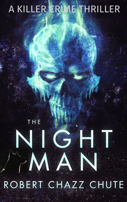
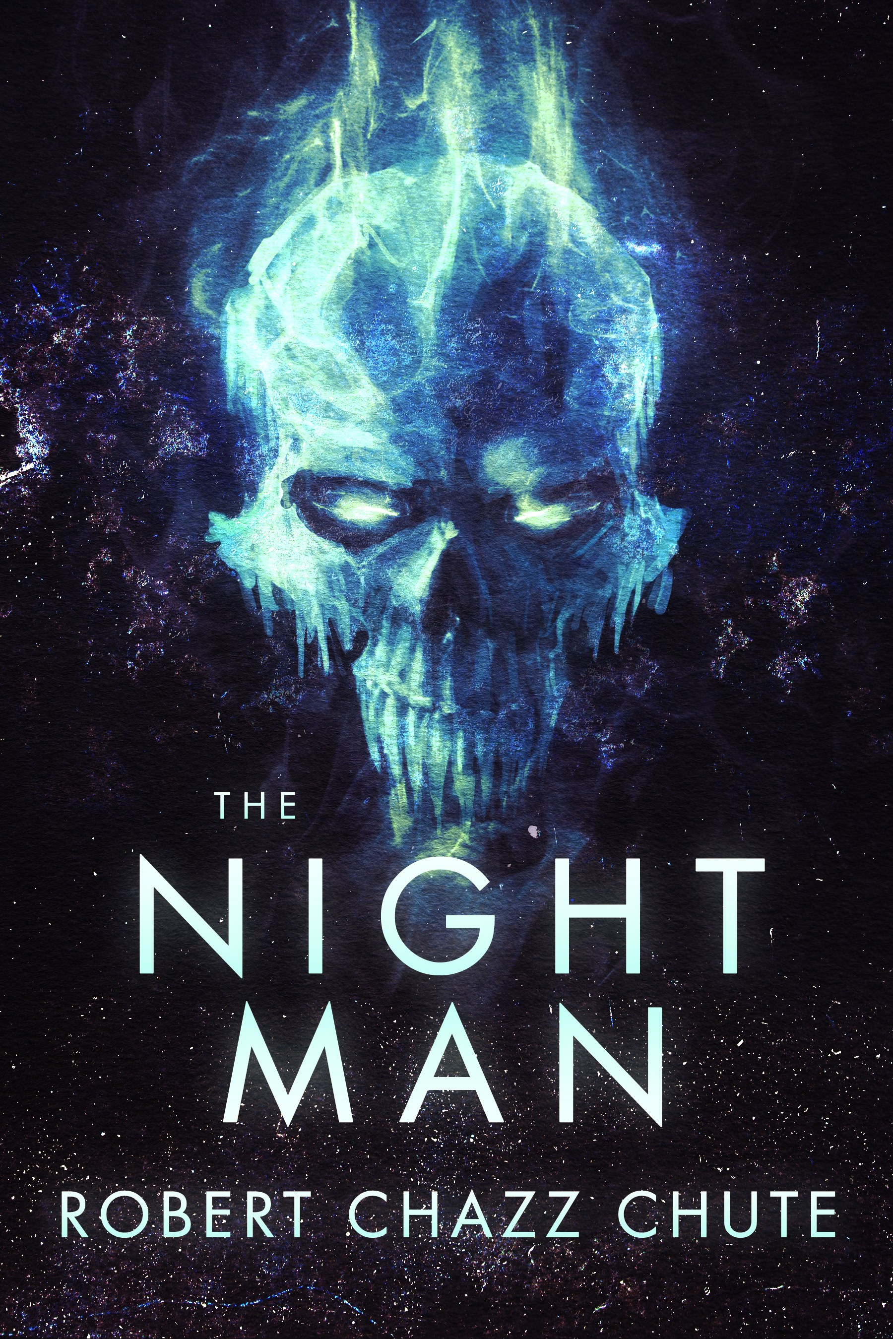
You can pick this ebook up for free today at this link: http://bit.ly/TheNightMan

Join my inner circle at AllThatChazz.com

See my books, blogs, links and podcasts.

Enter your email address to follow this blog and receive notifications of new posts by email.

Join 9,095 other subscribers
%d bloggers like this: