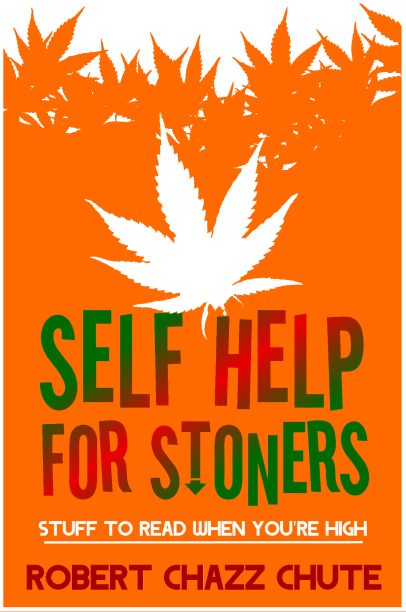
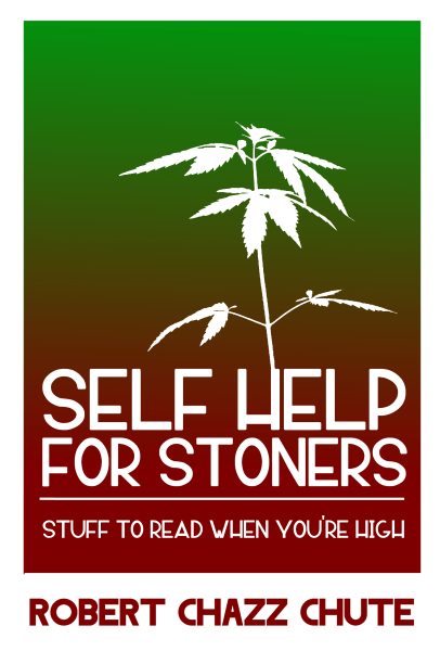
Kit Foster, a fabulous graphic artist, is kicking around some ideas for the cover of my ebooks (releasing very, scarily soon.)
Which cover do you think is better, orange or green? You can leave a comment or email me at expartepress@gmail.com. Thanks! I appreciate your input.
Filed under: Books, ebooks, What about Chazz?, ebook covers


Second one. It’s the sweetspot between being a pro/authoritative book and being a quirky jokey book. The first just says “I trying to do a cover that looks like I was stoned when I did it – therefore I’m cool”
The second says – “sure – you’re a stoner – but you could be a stoner doctor as well as a stoner loser…. either way – this book is some good sh*t”
Now – when can I order. I’m a doctor.. 😉
Haha! Thanks, Quickdraw! That’s two votes already! (One fer and one agin.) I hope a lot of people respond to the poll because I’m torn. Thanks for your reasoning. I’ll reserve any comment until I hear from the masses. Thanks again, Chris!
PS… I would move the silhouette of the grass plants at the top of Version 1 down to the top of Version 2 – to finish off the page.
Niiiiiice…
I like version one with the colors of version two.
Thank you! I appreciate everyone taking the time to help me with this. Got a bunch of votes on Twitter and another on Google+, too. (Still taking input today.)
Stoners 5 (the orange one) is better. Stoners 3 makes me feel like I should be unconscious lying on a beach sipping pina coladas.
I like the color scheme of version 2. The orange is a bit obnoxious. 🙂 And the slanting glare across the words is near blinding. HOWEVER, I like the weed on version 1 a bit better than 2.
Keep in mind, orange is my least favorite color.